06 .
06 .
14
What's new in Media Queries Level 4
Hot off the W3 presses, the Media Queries Level 4 spec was released yesterday. My eyes usually glaze over when I see super technical spec docs, but I decided to have a read this time. And I found some goodies!
Using ranges for numeric values
If we need to select a finite range of screen sizes, we're currently stuck with the clunky @media (max-width: 600px) and (min-width: 1000px). It's a lot to type and can be confusing to keep track of how max/min and the values all work in conjunction.
The new spec allows an easy reading single range instead.
@media (600px < width < 1000px) {}
http://www.w3.org/TR/mediaqueries-4/#mq-range-context
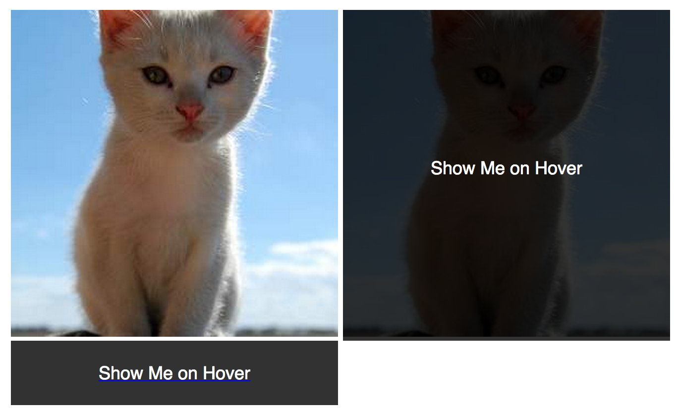
The hover media query
I've long been using Modernizr to test for touch support and accommodate the lack of a hover state on touch devices, but a native CSS solution is great step forward.
For example, use @media(hover) to display a caption as an overlay only when hover is available:
@media (hover){

    .cat {
        position: relative;
    }

    .cat .caption {
        position: absolute;
        left: 0;
        top: 0;
        right: 0;
        bottom: 0;
        opacity: 0;
    }

    .cat:hover .caption {
        opacity: 1;
    }
}
Friendly reminder: Small screen != touch device all the time, so don't bank on it!
http://www.w3.org/TR/mediaqueries-4/#hover
Lots more
Hover and range values are my favourites, but there are a lots of other minor improvements. Read up on them all here.