02 .
05 .
14
How to Style Input Type Range in Chrome, Firefox, and IE
The new HTML5 range input gives you a nifty slider UI component. But of course it looks wildly different and kind of blah across browsers. Don't worry, you can style input[type=range] in any browser!
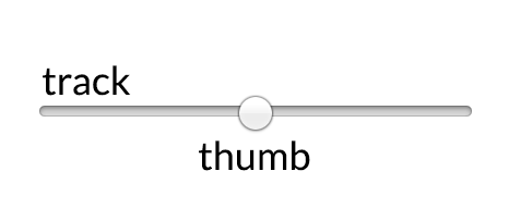
The syntax differs from vendor to vendor, but in all cases, you have two components that need to be styled. The track is the long piece representing the range, and the thumb is the nub you slide to pick a value.
It is possible to apply styles directly to input[type=range], but you may run into cross-browser troubles. Best to take advantage of the vendor specific track and thumb selectors as much as possible. We'll be using them to recreate this custom styled range slider.

Webkit based browsers (Chrome, Safari, Opera)
In webkit based browsers, the track is styled with a special pseudo selector ::-webkit-slider-runnable-track, and the thumb with ::webkit-slider-thumb.
Custom focus styles can also be applied on the thumb and the track. If you go that route, you'll have to remove default focus styles on the input itself.
Gotchas
You'll need to tell webkit you want nothing to do with their default styles by including a -webkit-appearance: none; on both the input and the thumb.
input[type=range]{
    -webkit-appearance: none;
}

input[type=range]::-webkit-slider-runnable-track {
    width: 300px;
    height: 5px;
    background: #ddd;
    border: none;
    border-radius: 3px;
}

input[type=range]::-webkit-slider-thumb {
    -webkit-appearance: none;
    border: none;
    height: 16px;
    width: 16px;
    border-radius: 50%;
    background: goldenrod;
    margin-top: -4px;
}

input[type=range]:focus {
    outline: none;
}

input[type=range]:focus::-webkit-slider-runnable-track {
    background: #ccc;
}
Firefox
In Firefox, the track is styled using the ::-moz-range-track pseduo selector, and the thumb using ::-moz-range-thumb.
Gotchas
There's currently a little bug in Firefox where outline: none doesn't remove focus styles. If you have a solid background colour, you can hack a fix by hiding the outline under a border.
You'll also need to give input[type=range] the same width as your track. It won't expand to contain the track on it's own.
input[type=range]{
    /* fix for FF unable to apply focus style bug  */
    border: 1px solid white;

    /*required for proper track sizing in FF*/
    width: 300px;
}

input[type=range]::-moz-range-track {
    width: 300px;
    height: 5px;
    background: #ddd;
    border: none;
    border-radius: 3px;
}

input[type=range]::-moz-range-thumb {
    border: none;
    height: 16px;
    width: 16px;
    border-radius: 50%;
    background: goldenrod;
}

/*hide the outline behind the border*/
input[type=range]:-moz-focusring{
    outline: 1px solid white;
    outline-offset: -1px;
}

input[type=range]:focus::-moz-range-track {
    background: #ccc;
}
Internet Explorer 10 +
Input type range is supported in IE10 and above. We can style the thumb with the ::-ms-thumb pseudo, and the track with ::-ms-track.
Gotchas
IE won't let the thumb overflow the track, so you'll have to settle for a taller track that's at least as big as the thumb.
Update, 15.10.2014: The thumb still can't overflow the track, but Graham Fowler pointed out a clever workaround. We can fake a wide enough track by adding a thick transparent border on the top and bottom of the track. We'll also move most of our styles to ::-ms-fill-lower and ::-ms-fill-upper instead of ::ms-track to make sure things like border-radius render correctly.
To remove the default tick marks, you'll need to set colour: transparent on the track.
Bonus
You can also use ::-ms-fill-lower and ::-ms-fill-upper to further customize the look of the track on either size of the thumb. Here, we've enhanced the UI by styling the lower part with a darker grey.

input[type=range]::-ms-track {
    width: 300px;
    height: 5px;

    /*remove bg colour from the track, we'll use ms-fill-lower and ms-fill-upper instead */
    background: transparent;

    /*leave room for the larger thumb to overflow with a transparent border */
    border-color: transparent;
    border-width: 6px 0;

    /*remove default tick marks*/
    color: transparent;
}
input[type=range]::-ms-fill-lower {
    background: #777;
    border-radius: 10px;
}
input[type=range]::-ms-fill-upper {
    background: #ddd;
    border-radius: 10px;
}
input[type=range]::-ms-thumb {
    border: none;
    height: 16px;
    width: 16px;
    border-radius: 50%;
    background: goldenrod;
}
input[type=range]:focus::-ms-fill-lower {
    background: #888;
}
input[type=range]:focus::-ms-fill-upper {
    background: #ccc;
}
Here's the full cross-browser code snippet and result.