15 .
02 .
14
CSS animations for usability
How to couple your CSS animations with JavaScript for interactive effects
One of the most loved features on my site is the pulsing "Get in Touch" text in the footer. It ended up on my site after I ran into a little usability issue. On short pages, clicking the in-page "contact" link doesn't scroll you very far down the page. It barely looks like anything has changed and the user is left wondering why nothing happened.
My solution: draw attention to the footer somehow! More specifically, let's make the "Get in Touch" heading jump out at you when that in-page link is clicked.
Step 1. Create a catchy CSS animation
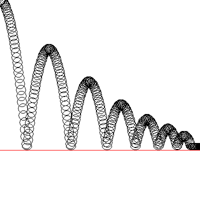
The pulsing effect I came up with uses several scale transforms to make the element grow and shrink. I modelled it roughly after a bouncing ball's trajectory, then fine tuned until it looked right.
@keyframes pulse {
    from {
        transform: scale(1);
        transform-origin: center center;
        animation-timing-function: ease-out;
    }
    25% {
        transform: scale(1.1);
        animation-timing-function: ease-in;
    }
    50% {
        transform: scale(1);
        animation-timing-function: ease-out;
    }
    74% {
        transform: scale(1.05);
        animation-timing-function: ease-in;
    }
    to {
        transform: scale(1);
        animation-timing-function: ease-out;
    }
}
Note: For simplicity, I've used un-prefixed CSS in the animation definiting. For full compatibilty, you'll also need a @-webkit-keyframes animation that uses -webkit-tranform.
Step 2: Apply the animation, but only when we have a class of 'animated'
For an animation that runs once on page load, our code would be something like:
.get-in-touch {
   animation: pulse 0.5s;
}
But we only want the animation to show at certain times, so let's have it run only when the element has a class of animated. We'll add that class dynamically in the next step.
.get-in-touch.animated {
    animation: pulse 0.5s;
}
Note: Again, you'll need to call these with -webkit-animation too for full browser-support.
Step 3: Trigger the animation based on user action
Remember, we want this text to pulse when a user clicks on the contact link, so let's listen for a click with a little jQuery, then trigger the animation by giving the text the .animated class we set up above.
$('#contact-link').on('click', function(){
    $('.get-in-touch').addClass('animated');
});
Step 4: Reset the animation when it's done
This works perfectly on the first go, but if I click the contact link again, I don't get the animation. Why? Because the text already has a class of animated. It can't be re-added if it's already there.
We need to reset our system by removing the animated class once the initial animation is complete. Thankfully, CSS fires a little magic "I'm done!" event called animationend when an animation completes.
You can listen for that event in jQuery like this:
$('my-animating-thing').on('animationend', function(){
    //it's over, do stuff
});
So in our case, we listen for the animation to finish, then remove the animated class to reset the system.
$('#contact-link').on('click', function(){
    $('.get-in-touch').addClass('animated').on('animationend', function(){
        $(this).removeClass('animated');
    });
});
Unfortunately, animationend isn't standardized across browsers yet, so we also need to listen for it's cross-browser variation, webkitAnimationEnd[1]. We pass them all in to jQuery's .on(), so your final snippet looks like:
$('#contact-link').on('click', function(){
    $('.get-in-touch').addClass('animated').on('animationend webkitAnimationEnd MSAnimationEnd oAnimationEnd', function(){
        $(this).removeClass('animated');
    });
});
Now your animation will run for a second time, and a third time, and as many times as you like.
The Final Code
CSS
@keyframes pulse {
    from {
        transform: scale(1);
        transform-origin: center center;
        animation-timing-function: ease-out;
    }
    25% {
        transform: scale(1.1);
        animation-timing-function: ease-in;
    }
    50% {
        transform: scale(1);
        animation-timing-function: ease-out;
    }
    74% {
        transform: scale(1.05);
        animation-timing-function: ease-in;
    }
    to {
        transform: scale(1);
        animation-timing-function: ease-out;
    }
}

.get-in-touch.animated {
    animation: pulse 0.5s;
}
JS
$('#contact-link').on('click', function(){
    $('.get-in-touch').addClass('animated').on('animationend webkitAnimationEnd MSAnimationEnd oAnimationEnd', function(){
        $(this).removeClass('animated');
    });
});
Animations and transitions are broadening the scope of what CSS can do for interactivity. We still need JS for event binding, so having your interactions states live inside CSS and then toggling them off and on with JS is a great strategy. It's one I've been employing more often lately, and I'd encourage you to give it a try too!
[1] When searching around for info on cross-browser support for the animationend event, I kept seeing exhaustive lists like animationend webkitAnimationEnd MSAnimationEnd oAnimationEnd, but no conclusive data on which browser versions needed the prefixed variants. A little testing revealed that IE > 10 supports the unprefixed animationend, and the latest version of Opera (19) has moved over to using webkitAnimationEnd, so we only need those two for full support. If you'd like to test this in other browsers, you can use this fiddle, and check to see if the animation runs after the first click. Send your results to @brnnbrn or hi@brennaobrien.com!