10 .
10 .
12
:before and :after are your friends
I can’t remember exactly when I wised up to the versatility of :before and :after, but they’ve been saving my butt in tricky styling situations often enough now to justify some long form praise.
[Side note: I sent out a rhetorical tweet in praise of these guys and got back the best answer ever.]
So, what makes :before and :after so useful? Come, take a walk with me through this recent example:
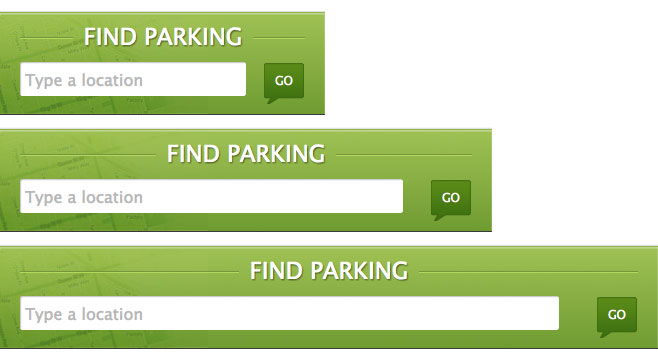
I was working on making this search form come to life. I’d gotten 95% of the way there and all that remained were the keylines on either side of the text.

If this were a fixed width site, I might slice the keylines with the rest of the background image and call it a day, but this site was responsive. I’d already accommodated for a flexible width background by using a CSS gradient and a right positioned image (of just the map overlay), so baking in the keylines wasn’t really an option. That, and my purist ambitions were driving me to avoid using images at all costs. Must. Be. Code. Wizard. I thought about making a zero height wrapper element with top and bottom borders, then relatively positioning the text element within, a technique I’ve employed in the past:
.find-parking {
    background: #fffbf2;
    padding: 50px 0;
}

.headline-wrap {
    width: 100%;
    height: 0;
    border-top: solid 1px #acacac;
    border-bottom:solid 1px #000;
    text-align: center;
}

h2 {
    display: inline;
    position: relative;
    top: -15px;
    padding: 0 15px; /*gap between keylines and text */
    font-size: 15px;
    line-height: 30px;
    background: #fffbf2; /*try removing this. it will break.*/
}
See the Pen Keylines with a Wrapper by Brenna O'Brien (@brenna) on CodePen.
This actually works pretty well, but you do need to set the background on the text element to be the same as the container background, otherwise the keylines would carry on straight through the text. With a gradient lurking in the background in this particular instance, it might be tricky to get right. Plus, the wrapper is extra non-semantic markup.
And then I stopped to think about exactly what I needed here: A little piece to the left of the text, and another little piece to the right, both to hold some embellishment. Duh doy. That’s precisely what :before and :after are for. We can still use the technique of zero height elements with top and bottom borders too. Just apply that to :before and :after instead of a wrapper.
:before and :after will create child pseudo-elements (first and last), so you’ll typically want to absolutely position them within the parent. Also remember that you need to add some content, but an empty string will work if you’re just decorating. Here’s the full solution, including some trickery to keep it flexible.
.find-parking {
  width: 100%;
  padding: 20px 0;
  overflow: hidden; /*clip the keylines outside the container */
  text-align: center;
  background: linear-gradient(top, #92b63c 0%, #608c1e 100%);
}

h2 {
  display: inline;
  position: relative;
  padding: 0 20px; /*gap between keylines and text */
  text-align: center;

  /*font styles - not needed to create the keylines*/
  color: #fff;
  font-size: 20px;
  font-family: 'Lucida Grande', 'Lucida Sans Unicode', Arial, Helvetica, sans-serif;
  text-transform: uppercase;
  text-shadow: 1px 1px 2px rgba(0, 0, 0, 0.7);
}

  h2:before,
  h2:after {
    content: "";
    position: absolute;
    top: 50%;
    width: 200%; /*can be set larger, but this was the largest it needed to be in my case*/
    height: 0;

    /* the actual keylines*/
    border-top: solid 1px #68832a;
    border-bottom: solid 1px #a8d244;
  }

  /*
   * This little bit of magic ensures the pseudeo-elements start
   * precisely at the boundaries of the text element, regardless
   * of the text element's width.
   */

  h2:before {
    right: 100%;
  }

  h2:after {
    left: 100%;
  }
See the Pen Flexible Keylines with :before and :after by Brenna O'Brien (@brenna) on CodePen.
And here’s the finished product, in all its flexible width glory.
The real benefit is that this happens purely in your CSS, as it should for something that’s purely stylistic. Give it a try the next time you want to keep your markup minimal but add CSS flourishes.
:before and :after work in all modern browsers, plus IE8 and above. While they’re not supported in IE7 – and we still officially support that browser in these parts – it’s not a concern if you’re using them for purely cosmetic features as we’ve done here. Progressive enhancement FTW.
Hug your pseudo-elements, kids!
[Side note the second: Thanks to Dave Rupert for his invaluable inspiration and advice on sharing more with the web community: "Write about a specific problem and how you solved it." Wise words.]
[And one more thing: Originally published here.]