31 .
07 .
12
Adventures in Stylesheeting
I have a bad habit of rearranging things.
My old roommate would often come home to the surprise of an alternately configured living room:
“Whoa. You just moved all this furniture around by yourself at 11PM on a Wednesday?”
“Yeah….”
“Okay, cool. Looks good.”
To her, my late night furniture wrangling must have seemed like a strange impulse. In truth, careful scheming lay beneath it all.
You see, my brain is wired to analyse, whether I like it or not. Sitting in that living room enough, I began to notice its weak spots:
“Only a couple people can really see the tv comfortably.“
“You can’t reach the coffee table if you’re sitting in the armchair.“
“Wouldn’t it be better if the records were beside to the record player? “
And thus the cogs would turn.
Having been set in motion, I was now subtly bound to the task of plotting the Great Configuration. Rewatching my favourite episodes of Always Sunny ? I’m sizing up the restrictions imposed by stereo equipment wiring. A few friends over for drinks? You might catch me gazing at the wall behind you, visualizing what the couch would be like there. Piece by piece, a plan would slowly emerge. And once I had a solid plan (or just a half-baked plan with enough fully-cooked frustration), resistance was futile. I’d spend an evening tearing apart and reconfiguring and, regardless of how long it took or how much I deviated from the original plan, I’d end up with a new and improved space.
But I do more than just sit on the couch…
When I began working with CSS on a regular basis, it didn’t take long for my brain to start twitching a little. My early stylesheets were typical of what most beginners would write. I’d include a reset and apply some basic global styles like font-family and margins on paragraphs, but for the most part, each piece of the page received its own set of styles.
This quickly felt rather inefficient. It also gets really boring. I’ve suffered through enough data entry at this point that I’ve developed a permanent aversion to mindless repetitive typing. And it’s not just inefficient and boring the first time you write it. Making changes to your site’s design at a later date is an unwieldy, tedious task. It’s almost enough to dissuade you from redesigning at all. It was clear I needed to refine my approach; time to rearrange my cluttered CSS.
“YOU GUYS, I’m going to embrace the cascade!”
With my next few projects, I strove for global styles. . .everywhere. In some cases, this works out really well. If you’ve got a small site and you also happen to be the designer, it’s not too hard to agree upon a standard style for “all h3s” or to consciously re-use style treatments in your design. Writing CSS in this way certainly reduces a lot of the repetitive typing overhead. Plus, there are potential performance gains to be found in the resulting smaller file.
Global styles like this are even necessary in some cases. When working with a CMS, your stylesheet needs to be prepared for unknown markup. Similarly, global styles fare much better than individual styles when it comes to scalability. New markup tends to “style itself” properly, and ad-hoc design modifications can often be implemented by changing only a couple lines of CSS. In many ways, this was a big improvement.
Nothing gold can stay: Enter the Preprocessor
As I moved on to bigger projects, I began employing several tools to help streamline my development even further. The idealist in me would love so much to create some sort of minimalist Grand Unified Stylesheet on every project, but it just ceases to be realistic on a large scale site. There will always be small exceptions to the generalizations you create. And, to style these exceptions, you’ll just end up writing lots of code that overwrites your precious cascade. It felt like I was back where I started; writing things twice (or more) and stuck with an inefficient, hard-to-maintain stylesheet.
Lucky for me, CSS Preprocessors were starting to crop up. Preprocessors essentially extend the capabilities of CSS, allowing us to use all sorts of magical things that every other developer already gets to use (i.e. variables, functions, conditionals). It sounded quite promising, so I gave LESS a go and was instantly impressed with the efficiency it brought to writing CSS.
Although there is some learning overhead, especially if you’re working with a team, the payoff is organized, maintainable code, all created with relative ease. One of the simplest use cases I suggest to anyone new to preprocessors is using variables for colours. Give your hex codes a friendly variable name (eg. @red) and BAM! You never have to waste time looking up #cf3636 again. Naturally, this also makes your code easy to update. Changing the variable value (a single line of code) makes a global change in seconds.
The small exceptions that proved difficult to handle in fully globalized styles are also handled nicely using mixins (available in both LESS and SASS) or SASS’s @extend functionality. Mixins work like functions, grouping a block of declarations together for repeated use, optionally taking variables as arguments. @extend works by serving a common base of declarations to similar (but not identical) style blocks. And the list of features and benefits that come with preprocessors really goes on and on. Get reading if you don’t believe me.
But there’s always a catch, right?
Right.
I’m not giving up on preprocessors anytime soon, but they ought to come with a warning. Just because you’re not typing it, doesn’t mean it’s not showing up in your compiled code. It’s easy to get carried away with nesting and mixins which look all clean and efficient in your text editor, but are actually a mess of complex selectors and repeated code in production. As others have noted, make sure you know what well written CSS looks like before you start dabbling with preprocessors and audit your output once you do.
A brief love affair with Twitter Bootstrap ended in the same sordid way. I was initially thrilled with all the time I was saving by using a front-end framework: typography, buttons, grid systems, and (dreaded) forms were all made for me already! But I ended up modifying or overwriting so much of the code that I essentially negated all that efficiency during customization. Plus, there was lots I wasn’t using — lines upon lines and bytes upon bytes, silently fattening my code until a disgusting file size prompted a much needed amputation. Zurb’s Foundation, a leaner framework intended for customization, has fared a little better, but my instinct still tells me it’s overkill for most projects.
What now, then?
I don’t think I’ll be using Foundation or Bootstrap as an entire framework again, but my experimentation was not in vain. I’ve gained useful code snippets and entirely new techniques for writing CSS. First, I absolutely love working with a fluid grid. Almost everything I build now is responsive, so the grid gives me an extremely solid base for that kind of structure. (Bonus: It’s also given the designers I work with a nice starting point for designs and keeps things consistent across mockups.) The code for Foundation’s fluid grid stands perfectly well on its own and I’ve had no trouble including it in my own CSS on recent projects.
Additionally, frameworks and pre-processors introduced me to the notion of OOCSS (Object Oriented CSS), pioneered by Nicole Sullivan. There’s lots to read up on here, but in short, OOCSS breaks your styles down into reusable patterns that can be combined for ultimate scalability. The quintessential OOCSS example is the media object. Read it. Use it. Chris Epstein also has a fantastic presentation with practical examples on how to break up your styles into objects. I think I had a foggy vision of this in my early attempts at abstraction, so I’m happy to have come across a practical strategy for it.
Again, this comes with a bit of a warning. Extreme abstraction might not be necessary in all cases. If a pattern only appears once or twice, the extra time invested in creating an object is probably not going to pay off. I also prefer to apply most of my objects using classes in the markup, rather than going overboard with SASS includes. While “classitis” is icky, I’ll take it over a bloated stylesheet any day. I’m still leaning heavily on SASS for variables and file organization, and mixins are still valuable for code that needs to be repeated (eg. @font-face declarations).
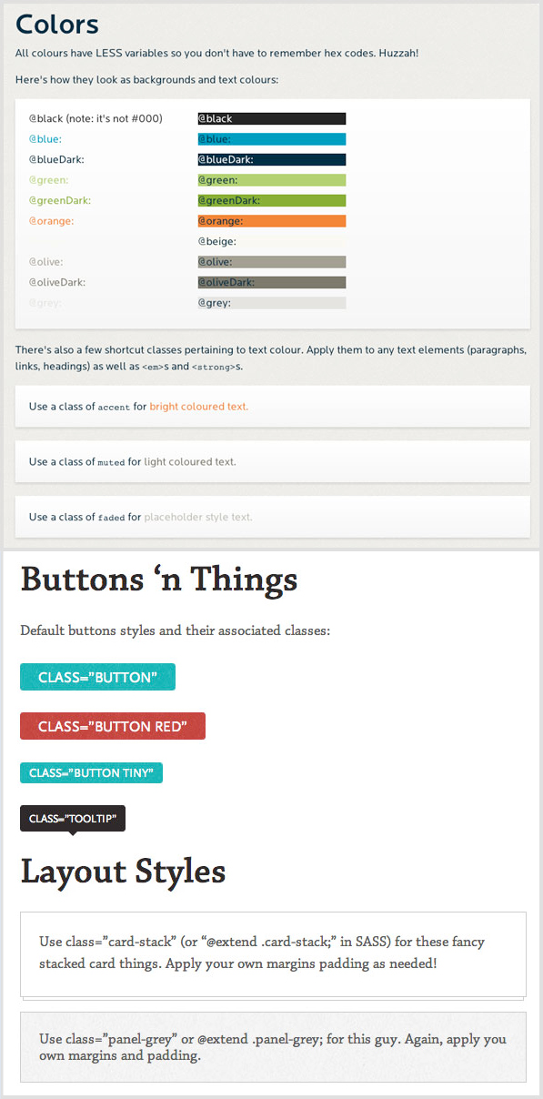
I’ve also gotten into the habit of creating style guides for my larger projects. They force you to be more organized with your code and document your work (both good habits) and they’ve been a hit with the team thus far; having a visual guide makes it much easier for another developer to step into the front-end code.
A few snippets from recent style guides:
Style Guide Samples
So that’s about where I’m at now. My next goal is to develop my own beautiful mini-Frankenstein of a framework encompassing all this. I’m liable to get frustrated and rearrange it all at any moment now, but I wouldn’t be in this game if I didn’t like being kept on my toes.
[Note: originally posted here]